Size does matter
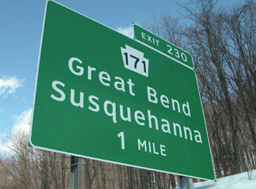
Trends often take time to gain momentum. This one in particular took a decade to develop. It's called Clearview. No, not another bottled water product but a new font appearing on road signs in the United States. Created purely for increased legibility and to reduce the effects of overglow on high brightness backgrounds. Typographer James Montalbano worked on a sans serif font to include six different weights, each having a version for positive or negative contrast applications. It has proved readable from 900 feet away, and the use of mixed case in lieu of all capital letters increases recognition 14 to 29 percent among older drivers at night, depending on the size of the type. The font has been approved by the U.S. Department of Transportation and will be implemented soon.
posted by Spray Glue at 7:50 am
![]()
![]()


0 Comments:
Post a Comment
<< Home